The Chameleon in Your Home: How to Choose the Perfect Paint Color combination for Your Living Room
The Chameleon in Your Home: How to Choose the Perfect Paint Color combination for Your Living Room
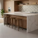
The living room is the heart of the home. It’s where you relax, entertain, work, and spend time with family. It’s a true chameleon, and the paint color you choose is the single most important factor in defining its mood, energy, and even its perceived size.
But let’s be honest: staring at a wall of paint swatches can be overwhelming. “Will this be too dark? Too boring? Will it make the room look small?”
Here at Homzinterio, we believe the perfect color isn’t just one you like—it’s one that perfectly suits your specific space. Your living room’s size, layout, and natural light are the keys to unlocking the right palette.
Here is our guide to choosing living room paint colors based on the kind of space you have.
1. For the Small or Low-Light Living Room
The Goal: To create an illusion of space and light, making the room feel larger, brighter, and more open.

- Go-To Palette: Light & Airy You can’t go wrong with classic optic whites, soft off-whites, light beiges, and pale greys. These colors are highly reflective and bounce light around the room, making the walls recede.
- Try: Cool Tones Colors like soft blues (think sky or seafoam), pale greens (like mint or sage), and light lavenders have a receding quality. They visually “push” the walls outward, making the space feel more expansive.
- Pro-Tip: Blur the Edges Paint the trim and the ceiling in the same light color as the walls, or a shade even lighter. This blurs the lines where the walls end, drawing the eye up and making the ceiling feel higher.
2. For the Large or Expansive Living Room
The Goal: To make the space feel cozier, more intimate, and less empty. A large room can handle more drama.
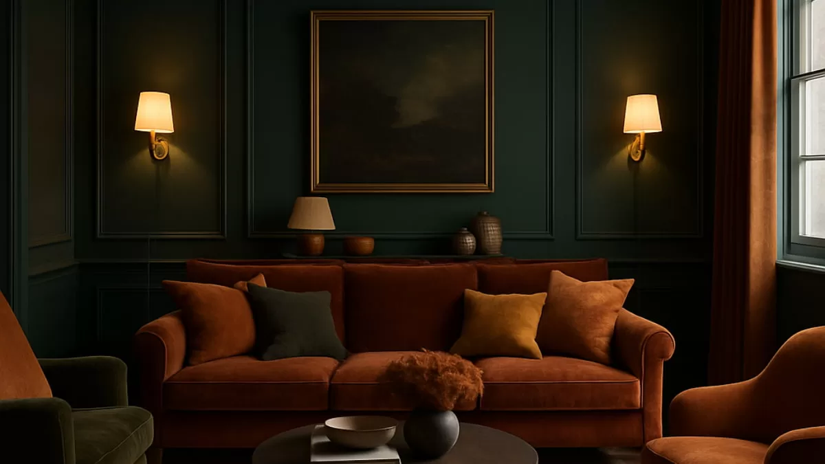
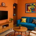
- Go-To Palette: Warm & Bold This is your chance to use the colors you’ve been dreaming of. Deep blues (navy, cobalt), forest greens, rich charcoals, or warm terracottas can make a large room feel more welcoming and enveloping. These colors absorb light, bringing the walls “in” for a cozier vibe.
- Try: The Statement Accent Wall While an accent wall can sometimes chop up a small room, it works perfectly in a large one. Paint the wall behind your main seating area or fireplace a bold, contrasting color to create a strong focal point and anchor the space.
- Pro-Tip: Consider “Color Drenching” For a high-design, sophisticated look, try color drenching. This involves painting the walls, trim, and even the ceiling in the same rich, moody color. It creates a stunning, immersive, and incredibly intimate atmosphere.
3. For the Open-Plan Living Space
The Goal: To create a sense of harmony and flow, while also defining a distinct “zone” for the living area.
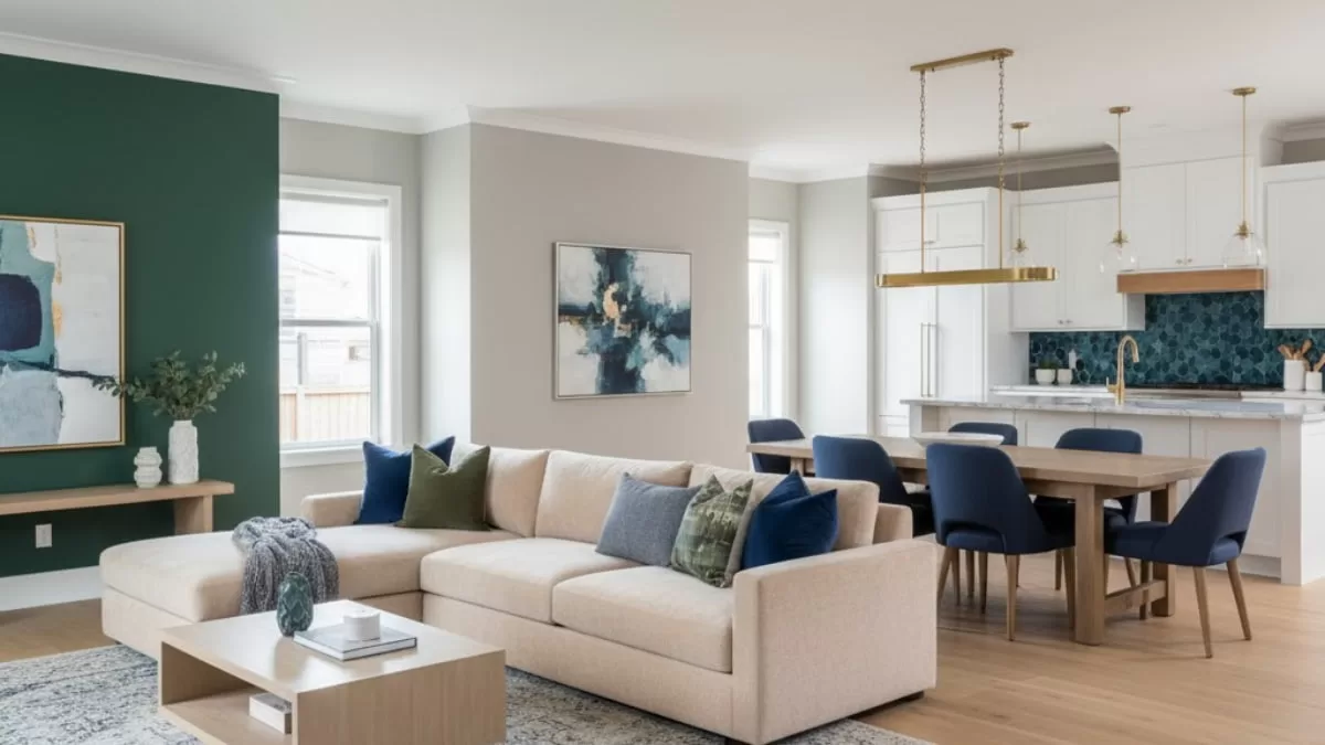
- Go-To Palette: The Cohesive Neutral The easiest way to unify an open-plan space (e.g., a combined living/dining/kitchen) is to use one versatile neutral color throughout. A sophisticated greige (grey + beige), a warm white, or a light grey works beautifully. You can then add different accent colors in each “zone” through textiles and decor.
- Try: Defining with an Accent Use that same neutral on all walls, but paint one feature wall within the living room portion of the space. This visually separates the seating area from the dining area without building a physical wall.
- Pro-Tip: Use Color to Connect Pick a secondary color from your kitchen backsplash or dining chairs and use it as an accent in your living room (think cushions, a rug, or artwork). This creates a “breadcrumb trail” of color that ties the separate zones together beautifully.
Before You Paint: The Final Checklist
Before you commit, run through these final steps:
- Look at Your Furniture: Your paint has to live with your sofa, curtains, and rugs. Is your furniture neutral? You can go bolder on the walls. Is your sofa a statement color? Your walls should probably be a supporting neutral.
- Understand Your Lighting: How does the room look at night? Artificial lighting changes everything. A color that looks soft and grey in daylight might look beige under a warm bulb or sterile under a cool white LED.
- The 60-30-10 Rule: This is a classic designer’s secret.
- 60% of your room should be the dominant color (your walls).
- 30% should be the secondary color (your furniture, curtains).
- 10% should be the accent color (pillows, artwork, decor).
- ALWAYS Test! Never, ever paint directly from the sample can. Paint a large poster board or piece of cardboard with your sample pot. Move it around the room at different times of the day (morning, noon, night) to see how the light really affects it.
Choosing a paint color isn’t just a technical decision—it’s an emotional one. It’s the backdrop to your life. By considering your space’s unique needs, you can move past the trends and find a color that truly feels like home.
Ready to transform your living room?
Finding the perfect palette is just the beginning. If you’re ready to create a space that is both beautiful and perfectly functional, the design experts at Homzinterio are here to help.
Contact us today for a design consultation!