The Ultimate Guide to Wall Paint Colour Combinations for 2025 & 2026: A New Era for Indian Homes
The Ultimate Guide to Wall Paint Colour Combinations for 2025 & 2026: A New Era for Indian Homes
If the last few years were about playing it safe with greys and stark whites, 2025 and 2026 are rewriting the rulebook. We are witnessing a massive shift in interior design—a move away from the “showroom” look toward spaces that feel lived-in, grounded, and deeply personal.
As we step into 2025, the color trends are clear: it’s about “Warm Minimalism” and “Joyful Expression.” Whether you are designing your 3BHK apartment in Bengaluru or styling a compact apartment in Mumbai, the new palette is rich with earthy terracotta, calming sage, and unexpected pops of “True Joy” yellow.
This guide will walk you through the defining color stories of the next two years, specifically curated for the Indian home.
Table of Contents
- The Vibe Shift: Why 2025 is Different
- Colors of the Year: The Big Predictions (2025-2026)
- Living Room Combinations: Hosting with Warmth
- Bedroom Sanctuaries: Sleep-Inducing Palettes
- Kitchens & Dining: Appetizing Hues
- The Indian Soul: Puja Rooms & Foyers
- Texture Talk: Finishes that Rule in 2026
- Lighting 101: Choosing Colors for Indian Sunlight
- Conclusion: Bringing the Magic Home
1. The Vibe Shift: Why 2025 is Different
For a long time, “modern” meant cool grey floors and white walls. But in 2025, that coolness is thawing. The biggest trend sweeping the interior world is Biophilic Design. It’s no longer just about having a potted plant in the corner; it’s about your walls mimicking the natural world.

We are seeing a move toward “Greige” (Grey + Beige) replacing pure grey, offering a warmer hug to your furniture. In Indian homes, where we often have dark wood furniture (teak, sheesham) or vibrant upholstery, these warmer backdrops bridge the gap between traditional Indian warmth and contemporary sleekness. The goal for 2025/2026 is to create a “Retreat”—a home that lowers your heart rate the moment you walk in.
2. Colors of the Year: The Big Predictions (2025-2026)
Before we dive into combinations, let’s look at the headliners defined by global color authorities like Dulux, Asian Paints, and Sherwin-Williams, and how they translate to our market.

- The Optimist: “True Joy” Yellow (2025)
Dulux’s color of the year, True Joy, is a vibrant, unapologetic yellow. In an Indian context, we don’t need to paint a whole room this color. Instead, think of it as the perfect “pop.” It works beautifully on an accent arch, the inside of a bookshelf, or a sunny breakfast nook. It symbolizes the optimism of a rising India. - The Grounding Force: Universal Khaki (2026)
Looking ahead to 2026, Sherwin-Williams predicts Universal Khaki. This isn’t the dull uniform khaki; it’s a sophisticated, brown-based neutral. It pairs exceptionally well with the Indian love for brass lamps and wooden artifacts. It’s the “new white” for those who want character without chaos.
3. Living Room Combinations: Hosting with Warmth
The living room is where Indian families gather, host, and relax. The 2025 palette here is all about “Social Comfort.”

A. Terracotta & Sand Beige
- The Vibe: Earthy, rooted, and distinctly Indian yet modern.
- The Look: Paint the main walls in a textured Sand Beige (lime wash finish looks incredible here). Use a deep, rich Terracotta for the TV unit wall or the wall behind your sofa.
- Why it works: Terracotta mimics the red earth of our landscape. When paired with beige, it doesn’t darken the room but adds a cozy “enveloping” feel. Add a jute rug and some cane furniture, and you have the perfect Japandi-Indian fusion.
B. Emerald Green & Champagne Gold
- The Vibe: Quiet Luxury.
- The Look: This is for the maximalists. A deep, matte Emerald Green on a feature wall paired with soft Cream or Champagne surrounding walls.
- Why it works: Green is nature’s neutral. It calms the eyes. In 2025, we are moving away from “leaf green” to deeper, moodier “forest” tones. This combination looks stunning with brass planters and warm yellow lighting, making your living room feel like a high-end hotel lobby.
Here are the details about the perfect paint color combination for the living room.
C. Ivory & Royal Blue
- The Vibe: Classic Heritage.
- The Look: If you have traditional furniture or heavy wooden pieces, this is your safest yet most regal bet. Keep 80% of the room Ivory (to reflect light) and use a Royal Blue for a statement niche or gallery wall.
- Why it works: Blue and White is a timeless combination (think pottery). It feels fresh, airy, and manages the heavy Indian summer heat by psychologically “cooling” the room.
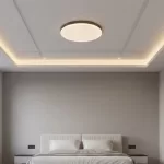
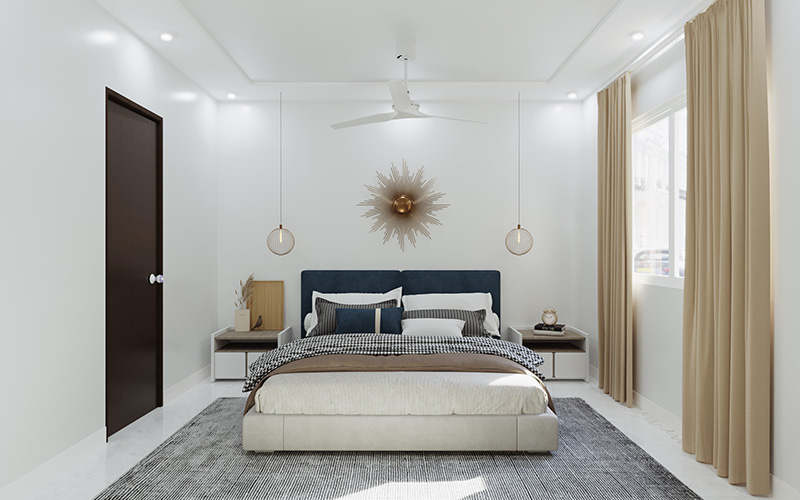
4. Bedroom Sanctuaries: Sleep-Inducing Palettes
For bedrooms in 2025, high energy is out. We want “Sleep Hygiene” colors—tones that signal to the brain that it’s time to rest.

A. Sage Green & Warm Walnut
- The Combination: Soft, grayish-green walls paired with walnut-colored wood accents (wardrobes or headboards).
- Why: Sage green is arguably the most popular bedroom color for 2025. It is biophilic at its core. Unlike mint green (which can feel clinical), Sage has grey undertones that make it sophisticated. It pairs perfectly with white linen sheets.
B. Dusty Rose & Warm Taupe
- The Combination: A “grown-up” pink. Dusty Rose is muted and muddy, not candy-sweet. Pair it with Taupe (a dark grey-brown) for a look that is romantic but gender-neutral.
- Why: This combination softens the light in the room, making everyone look good! It’s an incredibly soothing palette that feels like a warm sunset.
C. Lavender Mist & Off-White
- The Combination: Very pale, almost grey-lavender walls with creamy white trims.
- Why: Digital lavender has been trending for a while, but for walls, we dilute it. This shade is linked to calmness and meditation. In a chaotic city like Mumbai or Delhi, a Lavender bedroom acts as a mental detox zone.
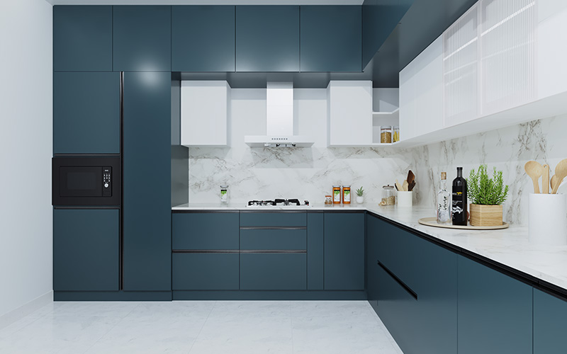
5. Kitchens & Dining: Appetizing Hues
The kitchen in an Indian home is a high-traffic zone. 2026 trends are moving away from the all-white “lab” kitchen (which is a nightmare to clean with turmeric stains anyway!) to colors that hide wear and induce appetite.

A. Mustard Yellow & Olive Green
- The Look: Olive green lower cabinets with Mustard Yellow wall tiles or painted upper walls.
- Why: It sounds bold, but it’s organic. Think of a sunflower field. These colors stimulate appetite and conversation. They also hide fingerprints and stains much better than glossy white.
B. Warm Cocoa & Cream
- The Look: A “Latte” inspired kitchen. Cream walls with rich Cocoa brown cabinets or an accent wall in the dining area.
- Why: Coffee tones are huge for 2026. They feel warm, aromatic, and sophisticated. This palette makes a compact dining area feel intimate and expensive.
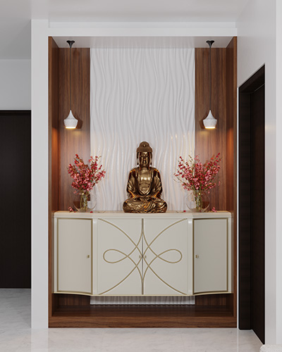
6. The Indian Soul: Puja Rooms & Foyers
You cannot design an Indian home without considering these sacred spaces.

- The Puja Room: In 2025, we are seeing a shift from standard yellow to Saffron Orange paired with Cream. Saffron has cultural significance and high energy. However, to keep it modern, use it on the wall behind the deity, keeping the side walls neutral to reflect light on the idols.
- The Foyer: This is your first impression. Teal & Grey is a rising star here. A deep Teal console wall greets guests with confidence, while Grey keeps the transition into the rest of the house smooth.
7. Texture Talk: Finishes that Rule in 2026
Color is only half the story; the finish is the other half. The days of “High Gloss” walls are fading.

- Matte is King: A super-matte finish hides undulations in the wall (common in older Indian apartments) and looks velvety and rich.
- Lime Wash & Plaster: This is the biggest texture trend. It adds a “cloudy,” old-world movement to the walls. It fits perfectly with the Wabi-Sabi (perfection in imperfection) aesthetic.
- Fluted Panels: Instead of just paint, 2025 is about painted textures. Painting fluted panels in the same color as the wall creates a shadow-play that adds depth without adding visual clutter.
8. Lighting 101: Choosing Colors for Indian Sunlight
A paint chip looks different in the store than it does on your wall. Here is a quick cheat sheet for Indian homes:

- North-Facing Rooms (Less Sun): The light here is bluish and cool. Avoid: Grey or Blue (it will look sad). Choose: Warmer tones like Terracotta, Cream, or Yellow to mimic sunlight.
- South/West-Facing Rooms (Harsh Afternoon Sun): These rooms get hot. Avoid: Bright Red or Orange (it feels too hot). Choose: Cool Sage Green, Teal, or Off-White to visually cool the space down.
9. Conclusion: Bringing the Magic Home
The color trends of 2025 and 2026 are an invitation to be brave. They ask you to step away from the safety of “Builder’s Beige” and embrace colors that make you feel something. Whether it’s the quiet calm of a Sage Green bedroom or the festive energy of a Mustard dining room, your walls are the canvas for your life.
At Homzinterio, we understand that changing your wall color is a personal journey. We don’t just pick a trend; we pick a mood that fits your family.
Ready to transform your home with these 2025 colors?
Let’s create a space that feels like you.
Book a Free Color Consultation with Homzinterio Today
FAQ – Wall Colour Trends for Indian Homes (2025–2026)
1. Which wall colour combination is best for Indian homes in 2025?
Warm minimalistic tones like Sage Green, Terracotta, Greige, and Ivory + Royal Blue are among the most popular choices for 2025. These palettes balance modern aesthetics with Indian textures, furniture, and lighting.
2. How do I choose the right paint colour for a small room?
For smaller spaces, pick lighter tones such as Off-White, Soft Beige, or Lavender Mist. These shades reflect light, making the room appear larger, airier, and more inviting.
3. What colours should I avoid in a north-facing room?
North-facing rooms receive cooler, bluish light. Avoid Blues and Greys, as they can make the room feel dull and cold. Instead, choose warmer colours like Cream, Terracotta, or Soft Yellow to brighten the space.
4. What are good paint ideas for a puja room?
Beautiful and spiritual options include Saffron Orange, Cream, Warm White, and Gold-inspired textures. These colours enhance divinity and create a serene atmosphere without overpowering the space.