How to Choose the Perfect Color Palette for Home Interior design
How to Choose the Perfect Color Palette for Home Interior design
Choosing the right color palette for home is the most transformative decision you’ll make for your home. It’s the difference between a room that feels like a “showroom” and one that feels like home.
As we move through 2026, we’re seeing a massive shift in Indian homes. The era of “clinical white” and “bland grey” is officially over. Today, it’s all about emotional resonance, choosing colors that don’t just look good on Instagram but make you feel grounded, energized, or peaceful.
At Homzinterio, we believe your walls should tell your story. Whether you’re moving into a new apartment or refreshing your current space, here is your ultimate guide to mastering the color palette.
1. The Psychology of Hues: How Color Affects Your Mood
Before you pick up a paintbrush, ask yourself: How do I want to feel in this room? Colors are psychological triggers. Here’s a breakdown of how different shades influence your daily life:
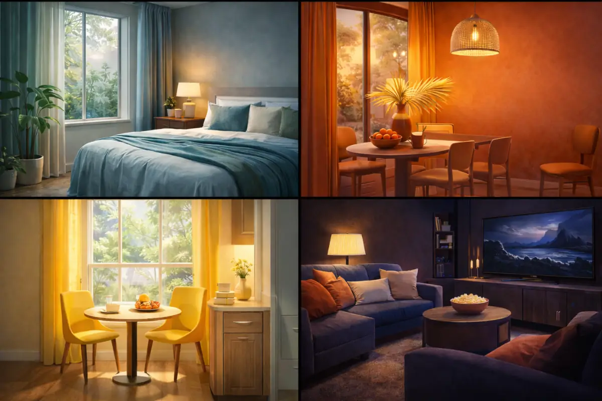
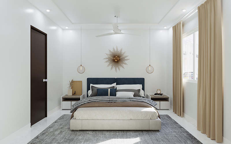
The Calm Curators: Blues and Greens
- Best for: Bedrooms, home offices, and meditation corners.
- Why it works: Blue lowers heart rates and encourages focus. Green, the color of nature, symbolizes growth and restoration. In the hustle of cities like Bengaluru or Mumbai, bringing “Biophilic” greens (like Sage or Olive) inside acts as a visual reset button.
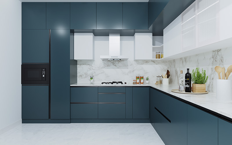
The Energy Boosters: Reds and Oranges
- Best for: Dining rooms and kitchens.
- Why it works: These are “appetite stimulants.” Red radiates passion and conversation, while Orange sparks creativity and sociability.
- The 2026 Twist: Instead of fire-engine red, opt for Terracotta or Burnt Sienna. These earthy versions provide the same energy but feel more grounded and “Vastu-friendly.”
The Happy Anchor: Yellow
- Best for: Hallways and breakfast nooks.
- Why it works: Yellow is the color of optimism. It mimics sunlight, making it perfect for areas that lack natural light.
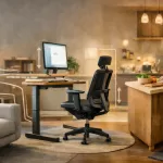
The New Power Players: Restorative Darks
- Best for: Media rooms and “moody” dens.
- Why it works: Deep Charcoal, Inky Navy, and Plum are trending for 2026. They create a “cocooning” effect that feels incredibly luxurious and intimate.
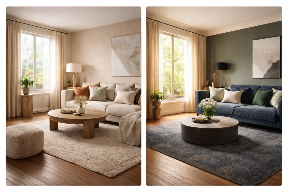
2. The Golden Ratio: The 60-30-10 Rule
Ever walked into a room and felt like something was “off,” but you couldn’t put your finger on it? It’s usually a lack of balance. Professional designers use the 60-30-10 rule to ensure harmony:
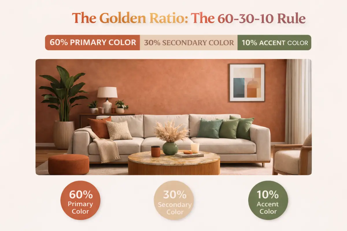
- 60% Primary Color: This is your anchor usually the walls and perhaps a large area rug.
- 30% Secondary Color: This provides contrast. Think upholstery, curtains, or a statement furniture piece.
- 10% Accent Color: This is the “jewelry” of the room. Use it for cushions, artwork, or vases.
Pro-Tip: If you’re nervous about color, keep your 60% and 30% neutral (like Beige and Cream) and go wild with your 10% accent (like a vibrant Teal or Mustard Yellow).
3. What Works: Trending Palettes for 2026
Based on the latest trends in Indian interiors, here are three palettes that are winning this year:
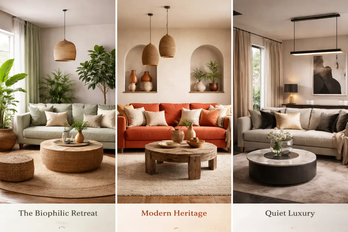
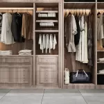
A. The Biophilic Retreat
- Colors: Sage Green, Mushroom Beige, and Warm Wood tones.
- The Vibe: Bringing the outdoors in. It’s soft, organic, and pairs beautifully with indoor plants and jute rugs.
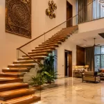
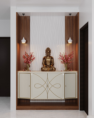
B. Modern Heritage
- Colors: Terracotta, Clay, and Warm Ivory.
- The Vibe: A nod to traditional Indian architecture (think Rajasthan palaces) but with a clean, modern finish. It’s incredibly cozy and hides dust better than pure white!
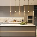
C. Quiet Luxury
- Colors: Warm Grey (Greige), Champagne, and Matte Black accents.
- The Vibe: Sophisticated and timeless. This palette relies heavily on texture think velvet pillows and linen curtains—to keep the neutrals from feeling “flat.”
4. The "Deal-Breakers": What Doesn't Work
Avoid these common pitfalls to keep your home from looking like a DIY disaster:
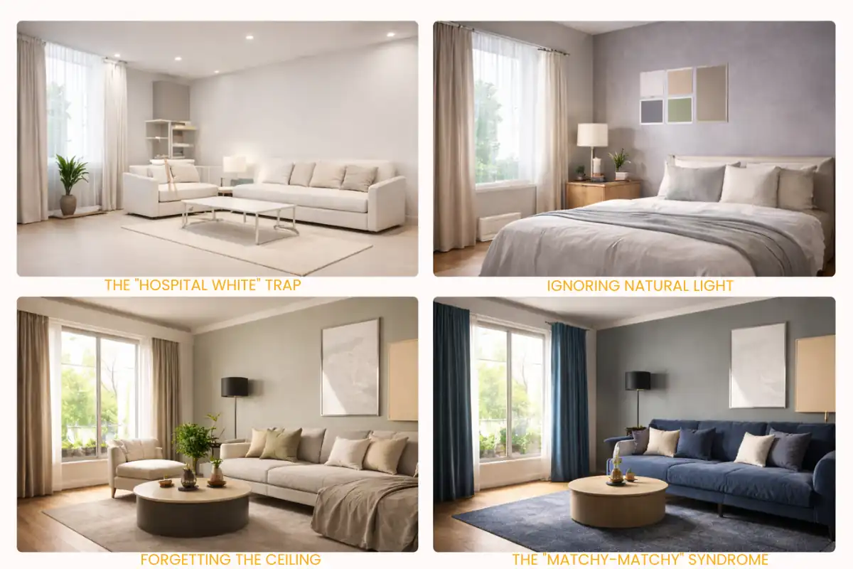
- Mistake #1: The “Hospital White” Trap. Pure, cool white can feel sterile and cold under LED lights. In 2026, we’ve moved to Warm Whites (Pearl, Linen, or Vanilla), which feel much more inviting.
- Mistake #2: Ignoring Natural Light. A color that looks great in the store might look purple in your north-facing bedroom. Always test “swatches” on your actual walls and observe them at different times of the day.
- Mistake #3: Forgetting the Ceiling. Most people default to white for ceilings. However, painting the ceiling a shade or two lighter than your walls—or even the same color for a “color drenching” effect—can make a room feel exponentially larger and more cohesive.
- Mistake #4: The “Matchy-Matchy” Syndrome. Don’t buy a blue sofa, blue curtains, and blue rug. You need variety in saturation and texture to give the room depth.
Now Check our recent blog about Painting Idea for every home
5. Lighting: The Secret Ingredient
Color is quite literally a reflection of light.
- North-Facing Rooms: Receive cool, bluish light. Avoid cool greys; use Warm Beiges to balance the chill.
- South-Facing Rooms: Are flooded with golden sun. This is where Deep Blues and Forest Greens truly shine, as the sun brings out their hidden undertones.
Find Your Perfect Palette!
Quick Quiz:
- Which of these describes your dream weekend?
- A. Hiking in the mountains (Try: Earthy Tones)
- B. Reading in a quiet café (Try: Soft Pastels)
- C. Hosting a lively dinner party (Try: Bold Accents)
- What’s your favorite material?
- A. Raw wood and Jute (Try: Olive and Beige)
- B. Marble and Gold (Try: Champagne and Charcoal)
- C. Velvet and Brass (Try: Navy and Terracotta)
The "Spatial Illusionist": Using Color to Bend Reality
If you think paint is just for aesthetics, think again. Color is a high-tech tool for architectural manipulation. Whether you’re dealing with a compact 2BHK in Bangalore or a room that feels a bit too “boxy,” you can use the science of light and saturation to literally change the perceived dimensions of your space.
Here is how you play “Architect” using nothing but a paintbrush:
1. The "Infinite Horizon": How to Make a Room Look Broader
To push the walls outward and make a narrow room feel expansive, you need to master the art of horizontal flow.
- The Strategy: Paint the end walls (the shorter ones) in a slightly darker or warmer tone than the long side walls.
- The Logic: Darker colors “advance” while lighter colors “recede.” By making the far walls pop, you draw the eye across the width of the room, creating an illusion of breadth.
- The “Pro” Hack: Use a monochromatic palette. When your furniture, rugs, and walls are within the same color family (e.g., varying shades of “Oatmeal”), the boundaries of where the floor ends and the wall begins disappear. No boundaries = infinite space.
2. The "Sky-High" Effect: How to Make a Ceiling Look Taller
Low ceilings can make a room feel oppressive. To “lift the lid,” you need to trick the eye into looking upward without stopping.
- The Strategy: The “Upper-Third” Rule. Paint the bottom two-thirds of your wall a solid color, and the top third (plus the ceiling) a crisp, bright White or very pale Cream.
- The Logic: This removes the harsh “line” where the wall meets the ceiling, making the vertical transition seamless.
- The “Genius” Hack: Vertical Stripes. But don’t think 1990s wallpaper think subtle, tone-on-tone textured paint or wide vertical panels. It acts like a pinstripe suit for your room, stretching the height instantly.
- Avoid: Crown moldings or heavy cornices in a contrasting color. They act like a “belt” that cuts the height in half.
3. The "Expanding Universe": How to Make a Small Room Look Bigger
The oldest trick in the book is “Paint it White,” but at Homzinterio, we find that a bit lazy. If you want a room to feel massive without it looking like a gallery:
- The Strategy: Cool Tones. Cool colors (Blues, Lavenders, Silvery-Greys) are “receding” colors. They literally feel further away from the human eye than warm colors.
- The Logic: By using a “Cool Mist” or “Pale Aqua,” the walls feel like they are backing away from you, giving you more “breathing room.”
- The “Pro” Hack: Paint the Woodwork. Paint your baseboards, door frames, and window trims the exact same color as the walls. This removes the visual “breaks” that usually chop up a small room, making the entire surface area look like one continuous, large plane.
4. The "Cozy-fy" Trick: How to Make a Huge Room Feel Intimate
Sometimes, a room is too big and feels cold.
- The Strategy: Color Drenching. Paint the walls, the ceiling, and even the built-in cabinets in a deep, saturated Mid-tone like Dusty Rose or Deep Teal.
- The Logic: This “wraps” the room around you, pulling the walls inward for a snug, high-end boutique hotel vibe.
Quick Cheat Sheet: The Spatial Cheat Code
| Goal | Technique | Color Vibe |
|---|---|---|
| Feel Taller | Paint ceiling lighter than walls | Cool Whites, Pale Blues |
| Feel Broader | Darker end walls, lighter side walls | Terracotta & Sand |
| Feel Bigger | Match trim to wall color | "Greige", Soft Sage |
| Feel Cozier | Paint the ceiling darker | Navy, Forest Green |
Conclusion: Ready to Color Your World?
At the end of the day, there are no “wrong” colors, only wrong applications. Your home is your sanctuary, and the palette you choose should be a reflection of what makes you happy.
Click here to book a session with Homzinterio’s expert designers today!
FAQ About Choosing the Perfect Color Palette for Your Home Interior
1. How to choose the perfect color palette for your home?
Start by deciding the mood you want to create calm, cozy, vibrant, or luxurious. Consider your room’s natural light, existing furniture, and flooring before selecting colors. Use a balanced approach like the 60-30-10 rule and always test paint samples on your actual walls to see how they look throughout the day.
2. What is the color palette rule in interior design?
The most widely used rule is the 60-30-10 rule. It means 60% of the room should be a dominant color (usually walls), 30% a secondary color (upholstery or curtains), and 10% an accent color (cushions or décor). This formula ensures harmony, contrast, and visual balance.
3. Which interior color is best for a home?
Warm neutrals like beige, greige, soft taupe, and warm ivory are considered the best overall interior colors because they are timeless, adaptable, and work well in different lighting conditions. They also create a welcoming and sophisticated atmosphere.
4. How to choose the right interior paint color for your home?
Always test swatches on your walls and observe them in morning, afternoon, and artificial light. Consider the direction your room faces north-facing rooms benefit from warm tones, while south-facing rooms can handle deeper shades. Avoid choosing paint solely based on how it looks in a store.
5. What is the most popular color palette for interiors?
In 2026, trending palettes include Biophilic tones (sage green and warm wood), Modern Heritage shades (terracotta and warm ivory), and Quiet Luxury combinations (greige with champagne and matte black accents). These palettes feel modern, elegant, and practical.
6. What is the most relaxing color for a room?
Soft blues and sage greens are the most relaxing colors because they reduce stress and create a calming environment. These shades work especially well in bedrooms, meditation spaces, and home offices where a peaceful atmosphere is important.